week 1
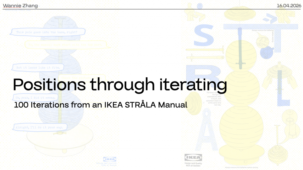
This project takes one step from the IKEA STRÅLA instruction manual as the starting point for 100 iterations. Through these iterations, I want to explore how different layout decisions affect readability, and how functionality and artistic expression interact within an instructional visual system.
This project developed from my previous Unit 1 project, Translating.
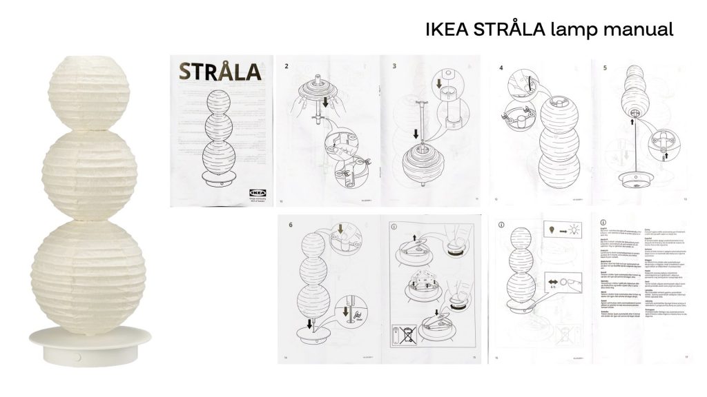
In that project, I used the IKEA STRÅLA lamp manual as my starting material and reinterpreted it through three translation methods: conversational, visual, and sound.
What interested me at that time was that the IKEA instruction manual appears very neutral, universal, and functional.
It seems to communicate in a clear and objective way.
But I wanted to test what would happen when this neutral design was translated through human experience. So instead of treating the manual as a fixed system, I used these three methods to shift it into other forms.
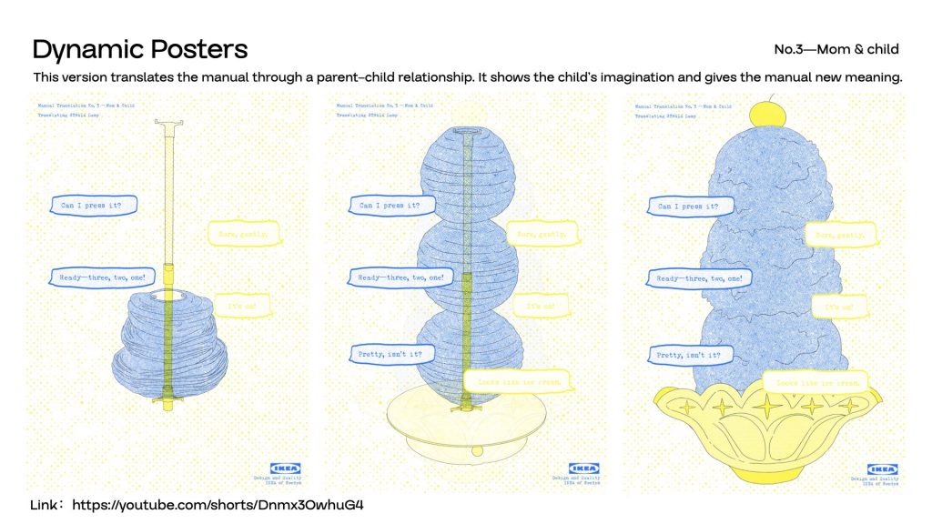
I translated the diagrams into dialogue, into visual reinterpretations, and into sound-based expressions. The final outcome combined these three directions and resulted in three dynamic posters.
These posters were used to represent the different behaviours and conversations that can emerge when different people try to use the same instruction manual. Through this, I was exploring individual differences that appear underneath a supposedly neutral design system.
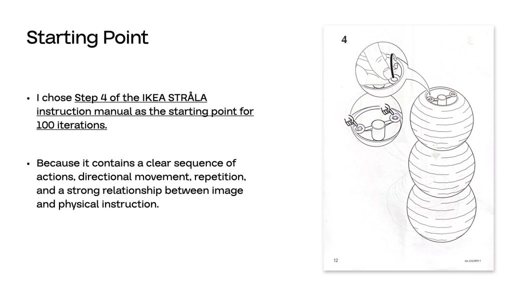
I chose this project as my iteration zero because it contained a question that I didn’t fully explore in Unit 1. In the second experiment of Translating, I removed the functional role of the instruction manual and kept only its artistic quality, transforming it into a poster based on the IKEA instruction. At that point, I became interested in the relationship between functionality and aesthetics within a universal design system. But because the project later moved towards combining conversation, image, and sound into the final dynamic posters, I didn’t have enough time to stay with that question and develop it further.
So for Unit 2, I wanted to return to that unfinished moment and use it as the starting point for a new line of enquiry.
The central question of this project is:
How far can an instruction manual be aestheticised before its readability and functionality begin to break down?
More specifically, I want to test how changes in typography, image treatment, and layout affect the way an instruction is read.
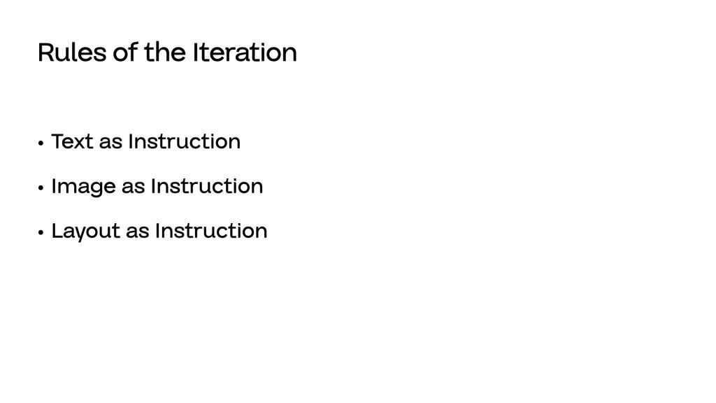
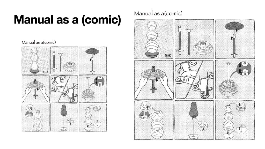
and about the Rules of the Iteration,The 100-page publication is divided into three chapters: Text as Instruction, Image as Instruction, and Layout as Instruction.
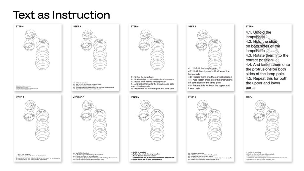
In the first chapter, Text as Instruction, I test how changes in type size and typeface influence emphasis, and clarity.
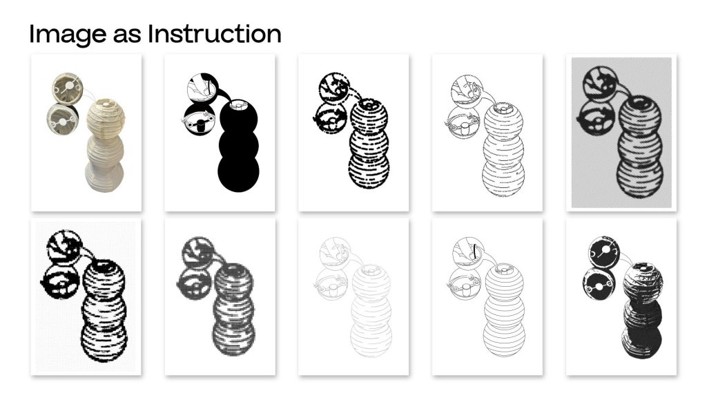
In the second chapter, Image as Instruction, I explore how different image treatments affect the visibility and interpretation of the action.
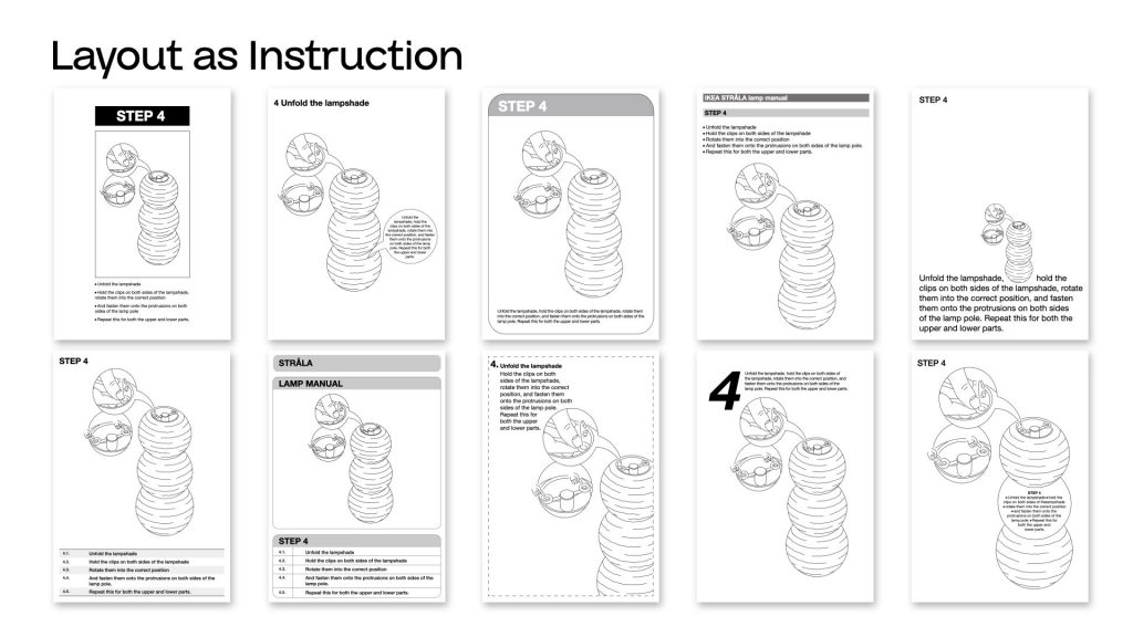
And in the third chapter, Layout as Instruction, I investigate how composition, and arrangement change reading order and readability.
week2
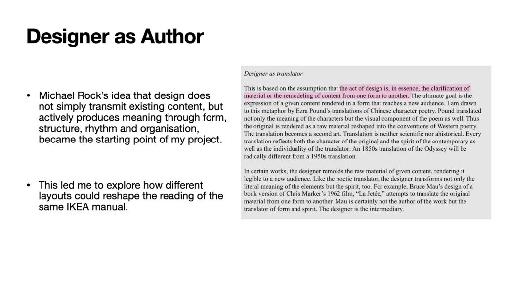
first of all i want to start to some reference,the first one is Michael Rock’s idea of Designer as Author.
He says designers do not only communicate information, but also create meaning through form.
This made me think: if the content stays the same, can changing the layout change the way people read the manual?
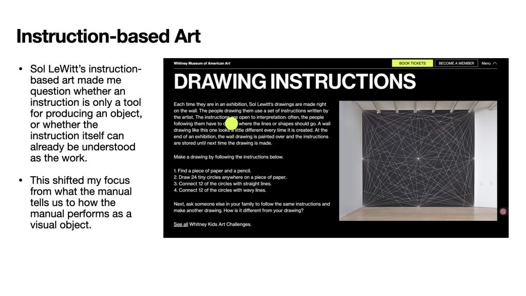
Sol LeWitt made me think differently about instructions.
Usually, instructions are just tools, but in his work, the instruction itself can become the artwork.
So I started to ask: if I reformat an IKEA manual, can it become more than just a neutral assembly guide? Can a manual exist on its own, independent of the product?
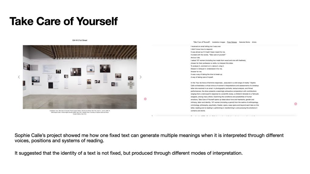
The next reference is Sophie Calle’s project Take Care of Yourself. In this project, she gave the same breakup letter to many different people, and each person interpreted it in a different way.
What I found very inspiring is that the text itself did not change, but the meaning kept changing through different forms of reading and interpretation.
This made me think about my own project. What if I use different layouts as different reading systems?
Based on these references, I decided to explore how a manual can shift into new identities through changes in form. By changing the layout of the IKEA manual, I want to show that it is not a neutral container. The same content can move between function, narrative, emotion, and art.
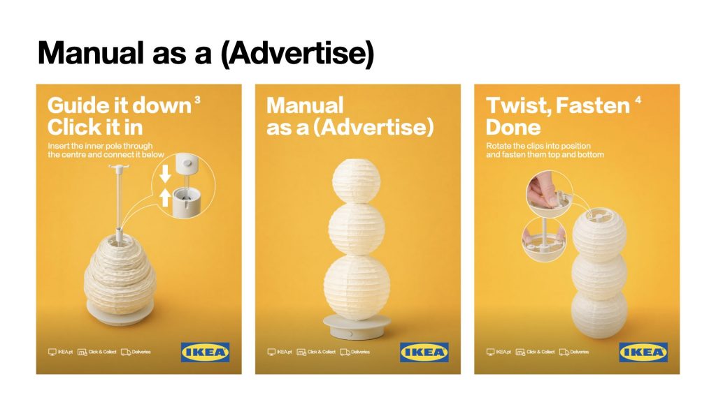
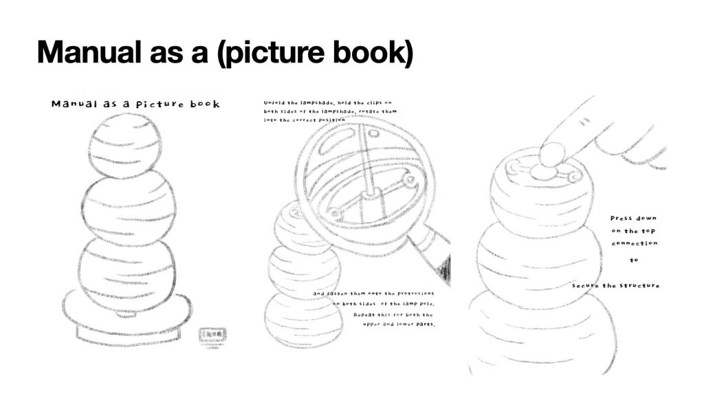
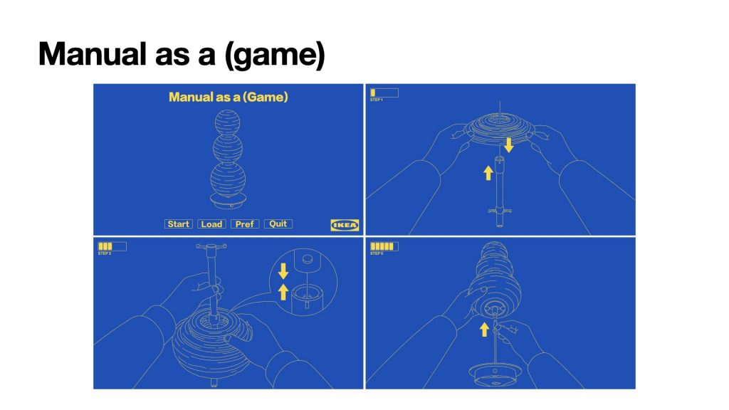
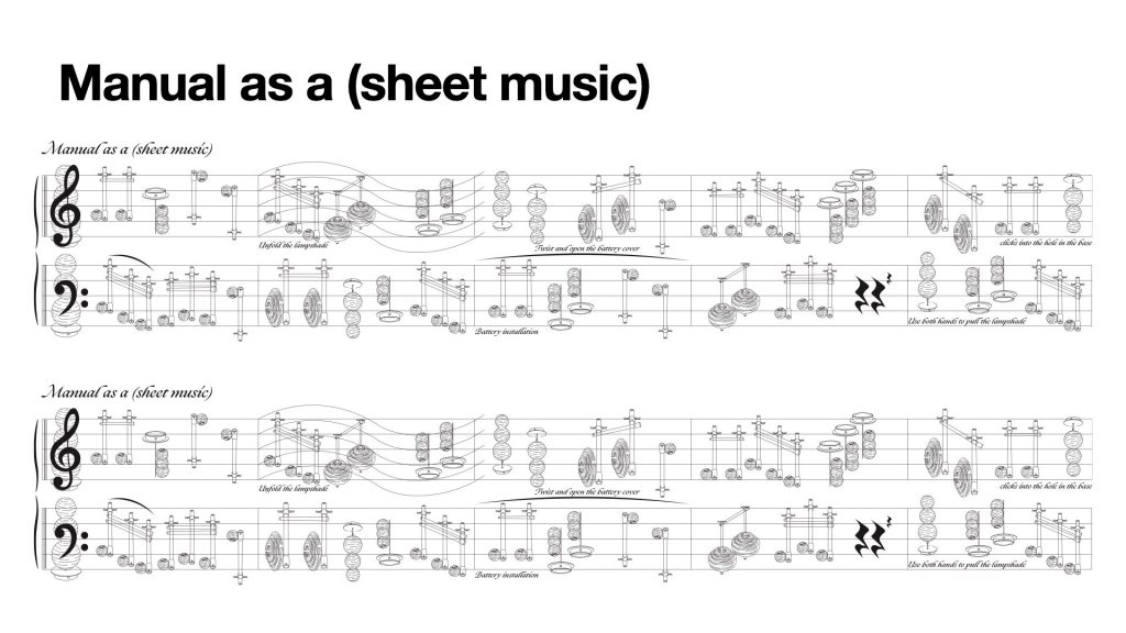
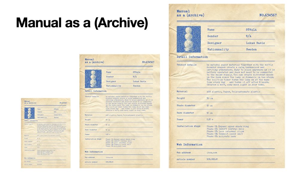
For my outcome, I made a series of different layout experiments using the same IKEA manual content. I also made the publication in different sizes, so that each version could match the format and scale of the identity it was taking on. Each version changes the reading experience and gives the manual a new identity. So the project shows that even when the content stays the same, form can still change meaning.
Leave a Reply