Author: Wannie Zhang

  • Positions through contextualising

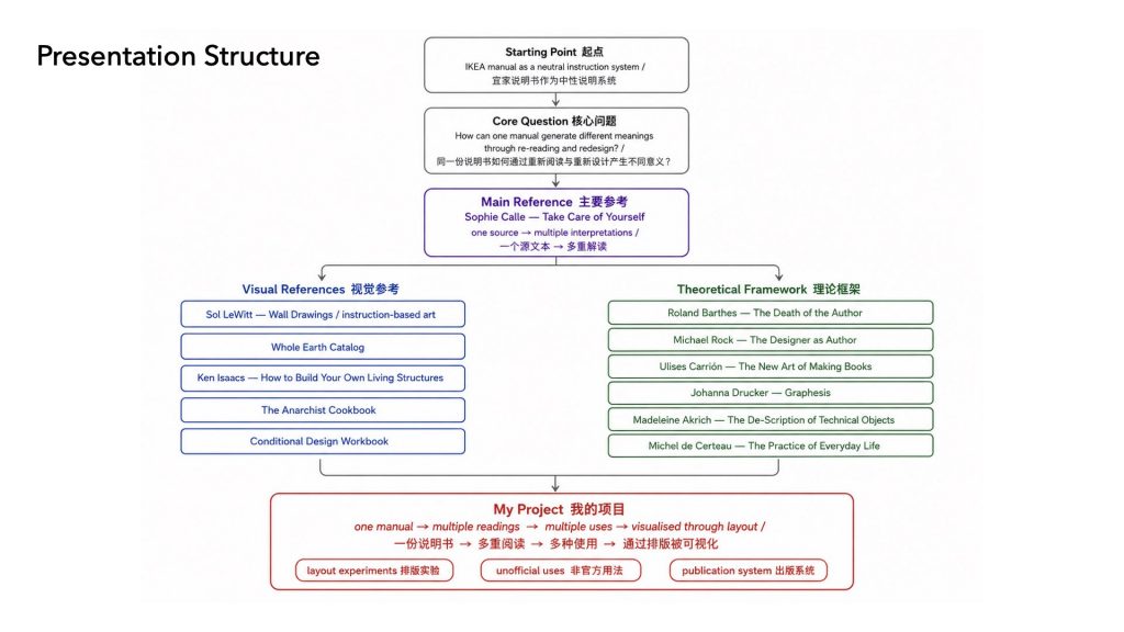
    First, I’ll briefly look back at my previous project, and introduce a new question that came out of it. Then, I’ll share some key references and explain how they helped me build the context and methods for my current work. Finally, I’ll show some simple visual experiments, which reflect my current position.


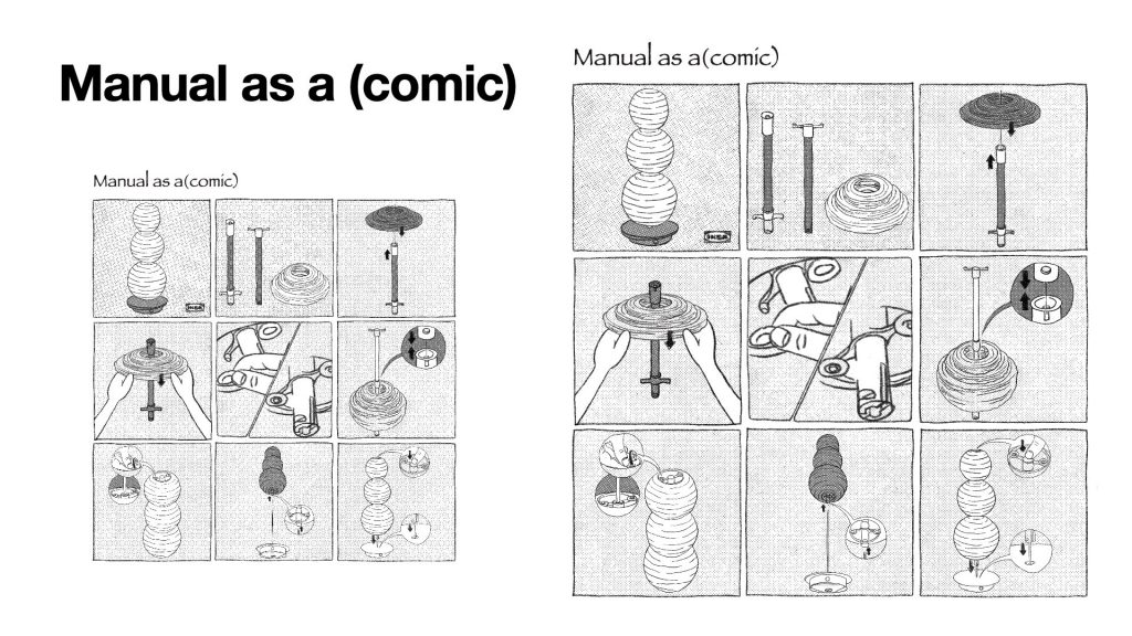
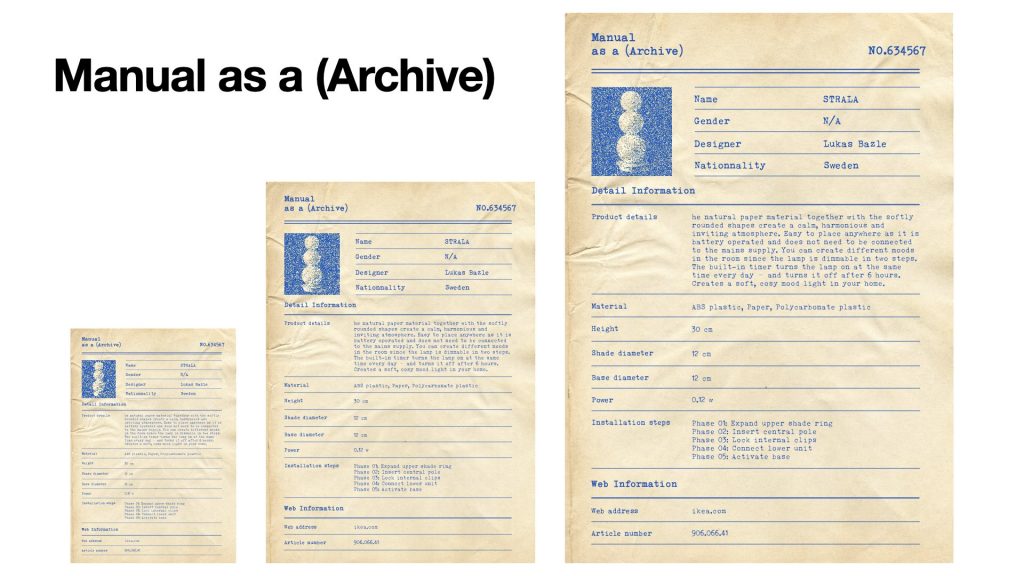
    To sum up my last project in one sentence: I was interested in how the same IKEA manual could produce different identities and meanings through changes in layout, reading order, and publishing format.


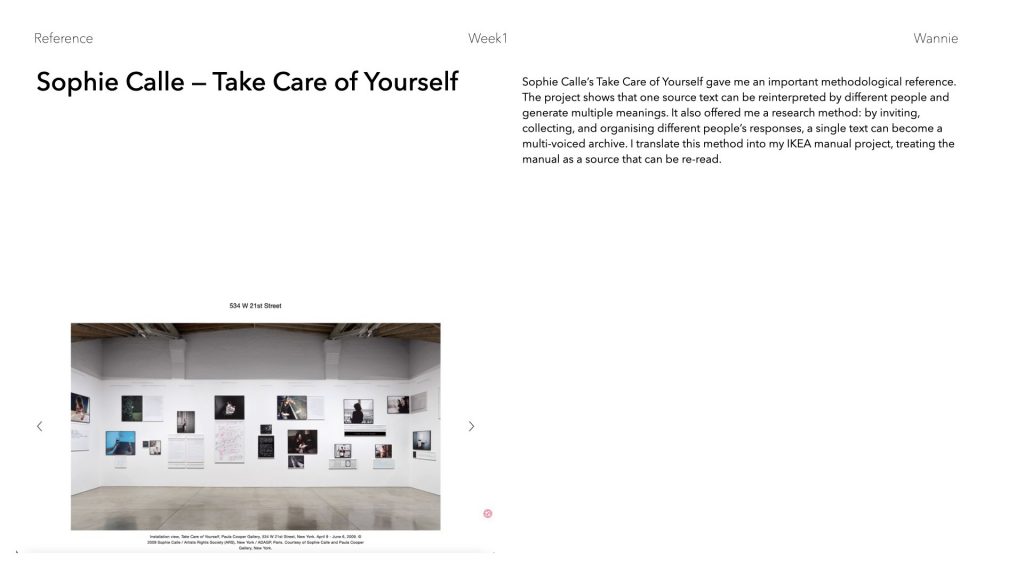
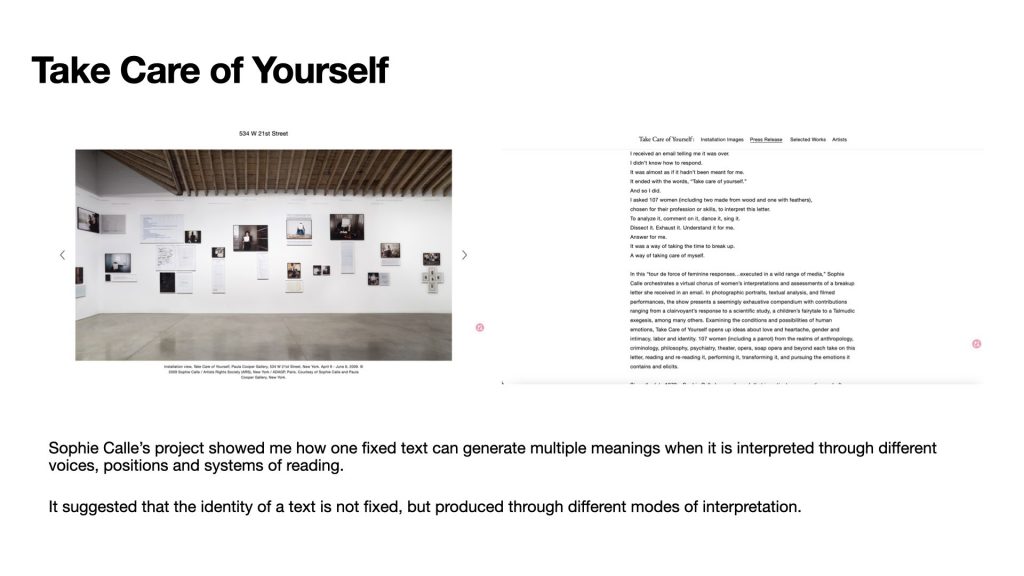
    At that stage, I found Sophie‘s Take Care of Yourself very useful as a reference. In this work, she gives the same text to different people, and each person reads, interprets, and responds to it from their own position. For me, what was important was not only the final responses, but also her method: inviting people, collecting their reactions, and organising these different readings into an archive.
    This made me think about my own project in a new way. If an IKEA manual looks neutral and objective, and if it assumes an ideal user, what happens when this same manual is given to different real users?


    So I began to use interviews, collection, and documentation as part of my method. I collected three examples of users who changed the function of IKEA objects in their own homes. For them, the manual was not something they had to follow exactly. It became more like a reference point. Based on the official instruction, they created their own new steps, and in doing so, they changed the identity of the object.

    So, to summarise my current project:

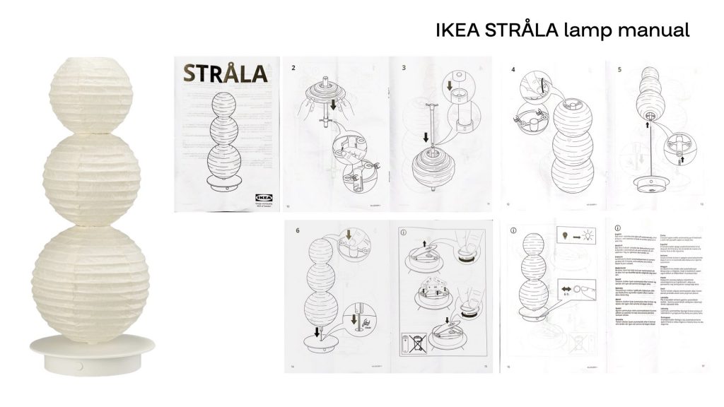
    My project started with layout experiments based on IKEA instruction manuals. At first, I explored how the same manual could create different identities through changes in layout, reading order, and format. Later, I shifted my focus from form to users: why do different people understand and use the same manual differently? Now, through interviews and layout experiments, I explore how an official manual can become an open system of different readings, unofficial uses, and new object identities.

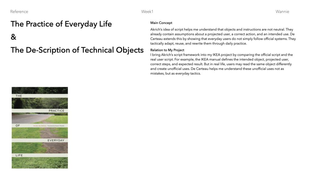
    These two references helped me place the personal interviews into a clearer theoretical framework. Both of them discuss how a technical object carries the designer’s imagination, but also how this imagination can be rewritten by users in real life.

    In The De-Scription of Technical Objects, she introduces the idea of the “user script”. She explains that designers often imagine a projected user: who will use the object, what abilities they have, what environment they are in, what sequence of actions they should follow, and what counts as correct use.

    I used this framework to look at my three interviews. It helped me understand that these unofficial uses are not just some random examples. They show how real users read, question, and rewrite the script of an object.
    In Akrich’s terms, shape, size, and angle are not fixed categories of script. Instead, they are material points where the official script can be read, challenged, or rewritten. In my project, shape, scale, and orientation become visual evidence of how real users de-script and re-script IKEA objects.

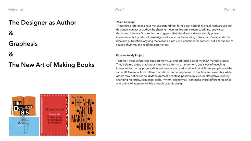
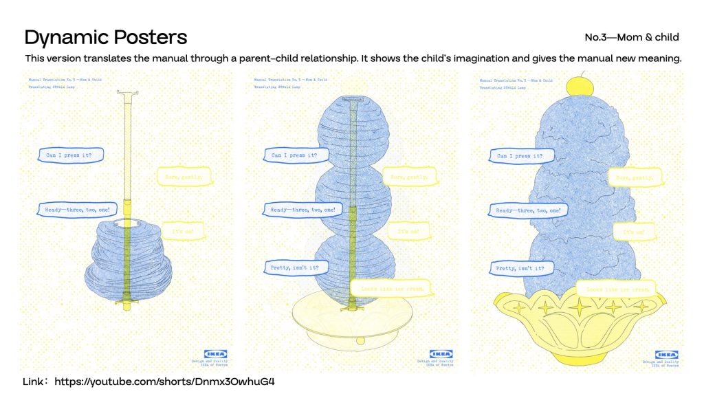
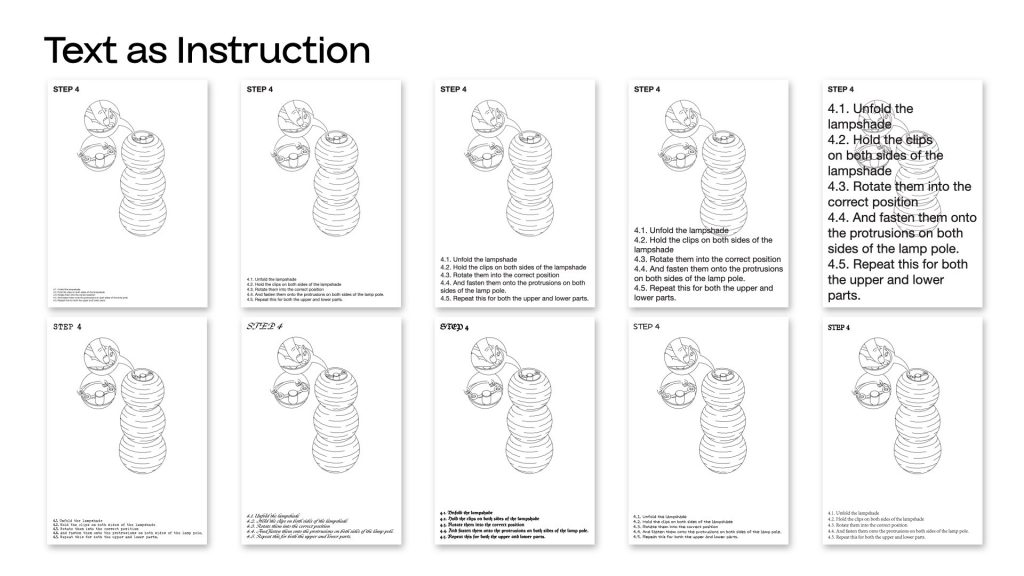
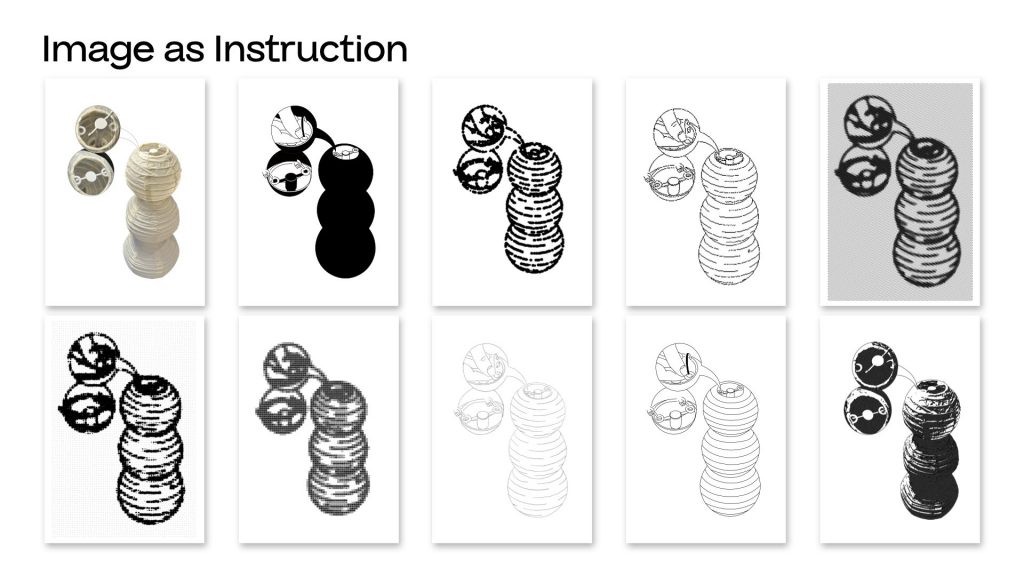
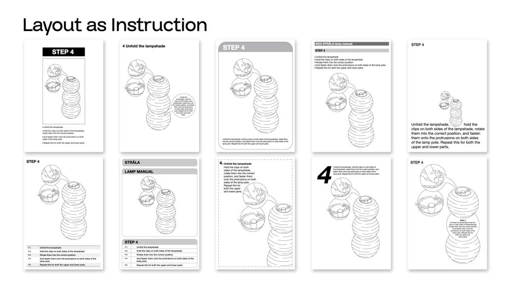
    From these references, I also started to think about how layout can express different people’s scripts. Layout is not only a formal arrangement. It can also reveal interpretation. In my project, different layouts are used to show how different people read the IKEA manual from different positions. Some users may focus on function and assembly. Others may notice shape, rhythm, domestic context, possible misuse, or alternative uses.


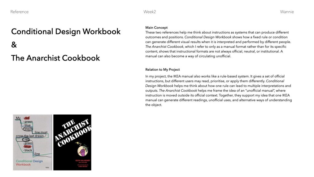
    In my project, the IKEA manual also works like a rule-based system. It gives a set of official instructions, but different users may read,or apply them differently. Conditional Design Workbook helps me think about how one rule can lead to multiple interpretations and outputs. The Cookbook helps me frame the idea of an “unofficial manual”, where instruction is moved outside its official context.

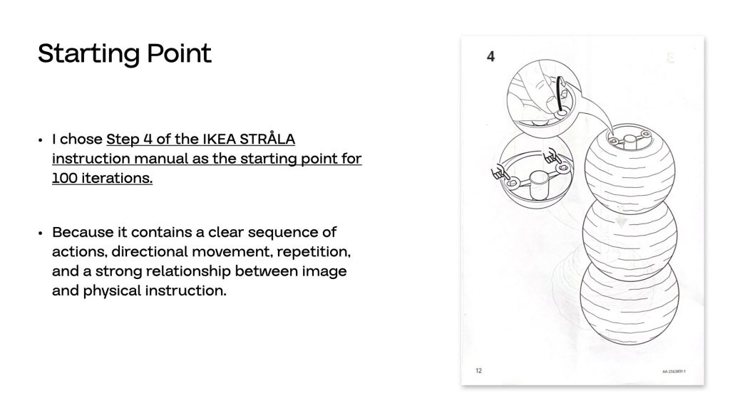
    Here are some of my visual experiments.

    I wanted to use different layouts to show different user scripts. When different users look at the same kind of instruction, they focus on different things. These different points of attention then lead to different results.

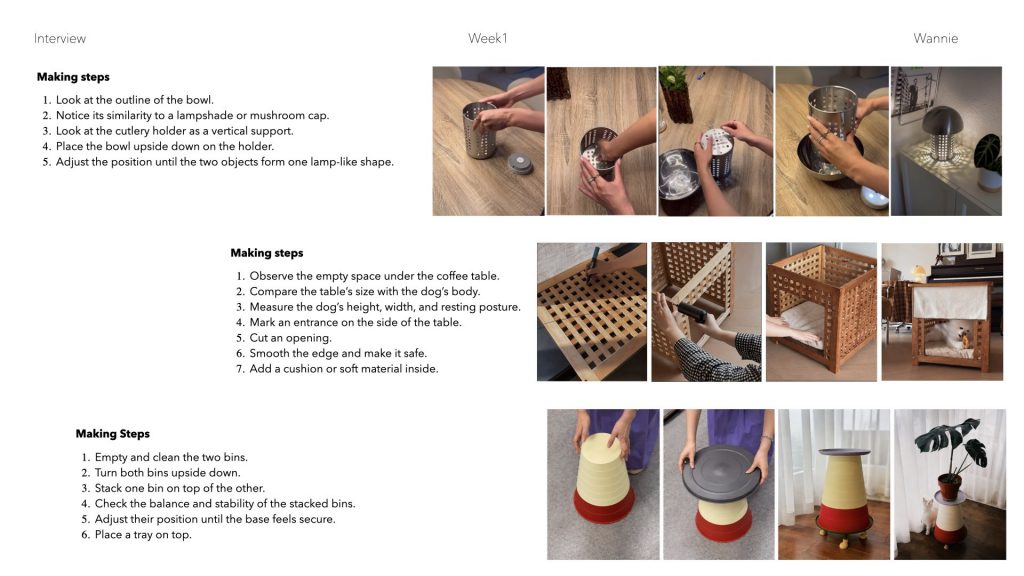
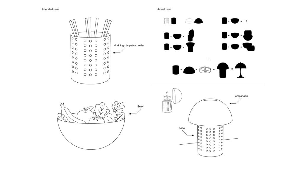
    For example, one real user combined a chopstick holder and a bowl to make a lamp. This happened because they noticed that the shapes of the two objects could fit together. For this user, the most important thing was not the original function, but the shape.


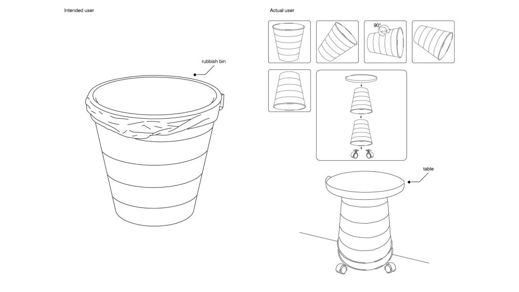
    Another user turned two bins into a table by stacking them and adding a tray on top. In this case, the user paid attention to the angle and orientation of the object. By turning and repositioning the bins, they created a new function.


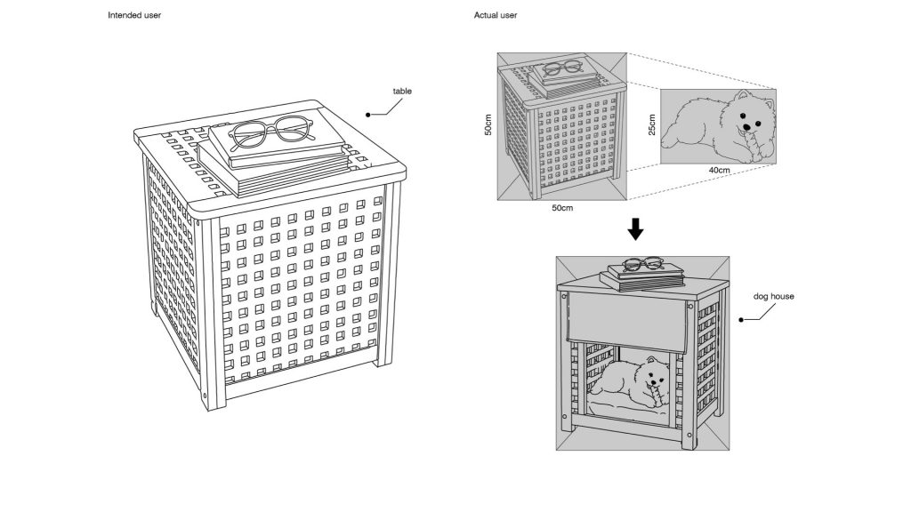
    The third user transformed a coffee table into a dog house. This happened because they noticed that the size of the table matched the size of their dog. So here, scale became the key point.

    These examples show that the same manual, which assumes an ideal user and a correct way of using the object, can produce very different results when it meets real users with different needs, spaces, and ways of seeing.

    In the next stage, I don’t want to only collect unofficial uses of IKEA objects. Instead of only asking, “What else can this object become?”, I want to ask, “Why does this object become meaningful in this person’s space?”I want to look for more references about objects in domestic space, especially how objects relate to people’s living rhythms, housing conditions, habits, and emotional traces. This will help me shift the project from the function of objects to the way people actually live with them.


    week2

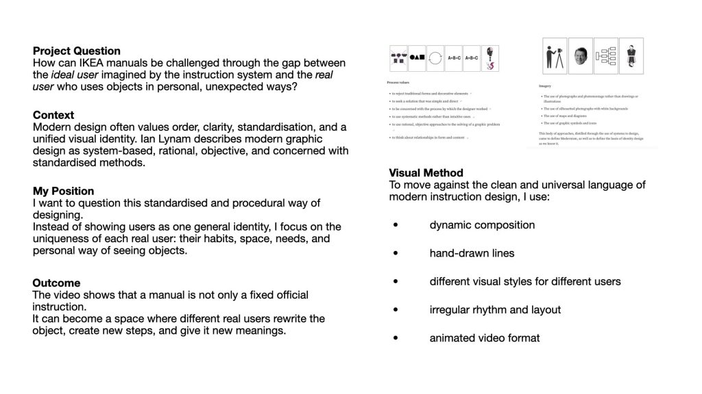
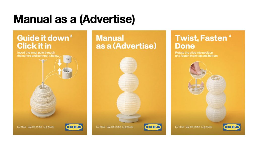
    I realised that IKEA manuals are designed for a very standardised user. The instructions assume that everyone will follow the same steps, use the object in the same way, and understand it in the same logic. This kind of design comes from modernist ideas about order, clarity, and unified systems.

    But through my interviews and research, I found that real users are actually very different from this imagined user. People change objects based on their own habits, living conditions, emotions, or needs. So I started to question these standardised and procedural design systems.

    Modernist design often uses clean systems, sans-serif typefaces, photography, photomontage, and universal graphic symbols to create one unified identity.

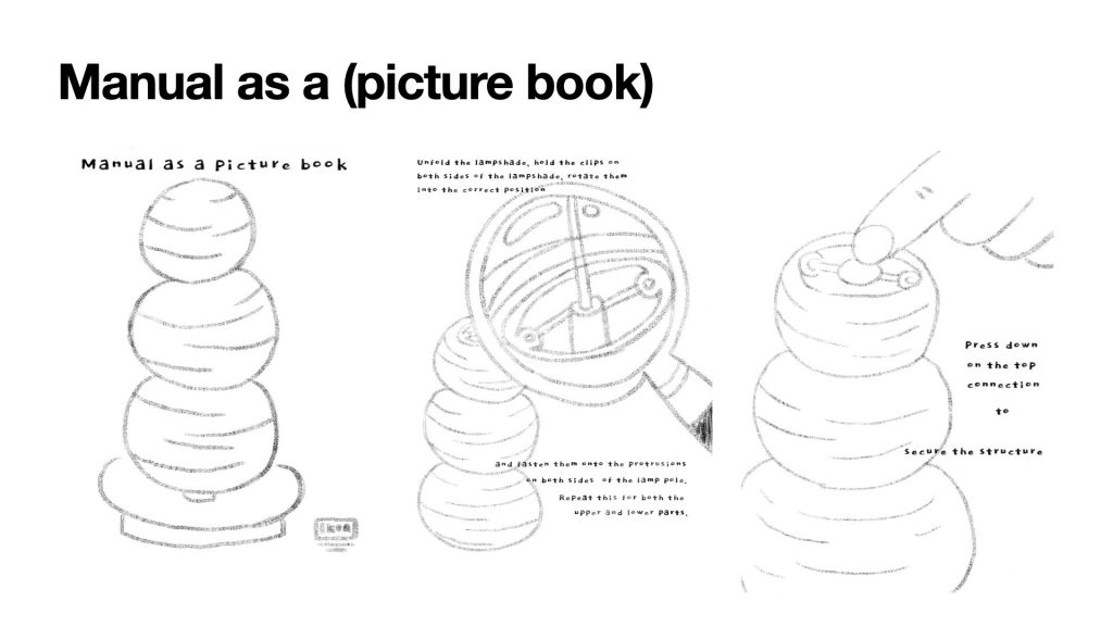
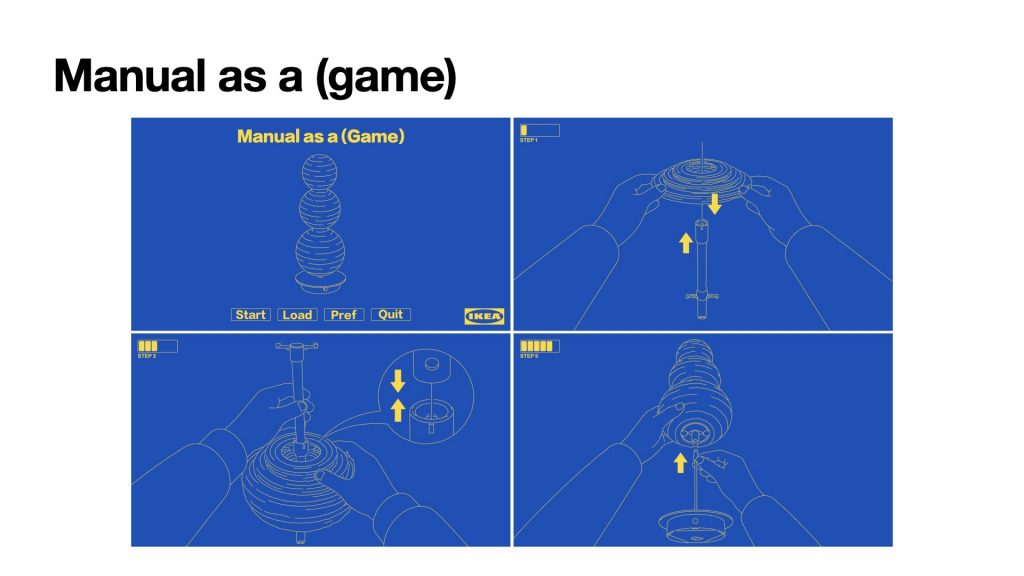
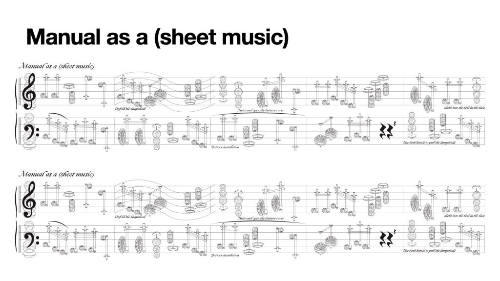
    So visually, I wanted to move in the opposite direction. Instead of using clean and standardised modernist visuals, I used hand-drawn elements, changing layouts, dynamic movement, and different visual styles for different users.

    I wanted each user to feel visually personal and unique, rather than part of one unified identity system.

  • Positions through iterating

    week 1

    This project takes one step from the IKEA STRÅLA instruction manual as the starting point for 100 iterations. Through these iterations, I want to explore how different layout decisions affect readability, and how functionality and artistic expression interact within an instructional visual system.

    This project developed from my previous Unit 1 project, Translating.
    In that project, I used the IKEA STRÅLA lamp manual as my starting material and reinterpreted it through three translation methods: conversational, visual, and sound.

    What interested me at that time was that the IKEA instruction manual appears very neutral, universal, and functional.
    It seems to communicate in a clear and objective way.
    But I wanted to test what would happen when this neutral design was translated through human experience. So instead of treating the manual as a fixed system, I used these three methods to shift it into other forms.
    I translated the diagrams into dialogue, into visual reinterpretations, and into sound-based expressions. The final outcome combined these three directions and resulted in three dynamic posters.
    These posters were used to represent the different behaviours and conversations that can emerge when different people try to use the same instruction manual. Through this, I was exploring individual differences that appear underneath a supposedly neutral design system.

    I chose this project as my iteration zero because it contained a question that I didn’t fully explore in Unit 1. In the second experiment of Translating, I removed the functional role of the instruction manual and kept only its artistic quality, transforming it into a poster based on the IKEA instruction. At that point, I became interested in the relationship between functionality and aesthetics within a universal design system. But because the project later moved towards combining conversation, image, and sound into the final dynamic posters, I didn’t have enough time to stay with that question and develop it further.
    So for Unit 2, I wanted to return to that unfinished moment and use it as the starting point for a new line of enquiry.


    The central question of this project is:
    How far can an instruction manual be aestheticised before its readability and functionality begin to break down?
    More specifically, I want to test how changes in typography, image treatment, and layout affect the way an instruction is read.

    and about the Rules of the Iteration,The 100-page publication is divided into three chapters: Text as Instruction, Image as Instruction, and Layout as Instruction.

    In the first chapter, Text as Instruction, I test how changes in type size and typeface influence emphasis, and clarity.


    In the second chapter, Image as Instruction, I explore how different image treatments affect the visibility and interpretation of the action.


    And in the third chapter, Layout as Instruction, I investigate how composition, and arrangement change reading order and readability.


    week2

    first of all i want to start to some reference,the first one is Michael Rock’s idea of Designer as Author.
    He says designers do not only communicate information, but also create meaning through form.
    This made me think: if the content stays the same, can changing the layout change the way people read the manual?

    Sol LeWitt made me think differently about instructions.
    Usually, instructions are just tools, but in his work, the instruction itself can become the artwork.
    So I started to ask: if I reformat an IKEA manual, can it become more than just a neutral assembly guide? Can a manual exist on its own, independent of the product?

    The next reference is Sophie Calle’s project Take Care of Yourself. In this project, she gave the same breakup letter to many different people, and each person interpreted it in a different way.

    What I found very inspiring is that the text itself did not change, but the meaning kept changing through different forms of reading and interpretation.

    This made me think about my own project. What if I use different layouts as different reading systems?


    Based on these references, I decided to explore how a manual can shift into new identities through changes in form. By changing the layout of the IKEA manual, I want to show that it is not a neutral container. The same content can move between function, narrative, emotion, and art.


    For my outcome, I made a series of different layout experiments using the same IKEA manual content. I also made the publication in different sizes, so that each version could match the format and scale of the identity it was taking on. Each version changes the reading experience and gives the manual a new identity. So the project shows that even when the content stays the same, form can still change meaning.

  • Unit 1-Methods of translating

    Written Response

    This written response re-presents Hito Steyerl’s In Defense of the Poor Image (2009) through the structural method of Raymond Queneau’s Exercises in Style (1998).

    Steyerl describes the “poor image” as a low-resolution file—copied, shared, and circulated—whose value lies not in clarity but in access.

    Following Queneau’s approach, I retell this same idea in several stylistic variations, mirroring how the image itself changes through reproduction.

    Neutral:

    A poor image travels fast.

    It is compressed, duplicated, and reposted.

    Each copy loses quality but gains audience.

    Authorship fades; circulation grows.

    Like Barthes’ idea of “the death of the author”, it survives through others.

    Metaphorically:

    The poor image is a migrant bird.

    Its feathers—pixels—are ruffled by compression winds.

    It crosses borders carrying fragments of forgotten cinema.

    While high-definition eagles perch in museums,

    these small grey sparrows sing across unstable skies.

    Retrograde:

    First there was a blur on my screen, then a torrent link,

    before that a lost archive, and earlier still a camera shutter.

    Rewind further: a promise of high definition,

    a belief that purity meant truth.

    Now, the poor image flies backwards—from perfection to participation.

    Surprises:

    How fast it spreads!

    And how tiny it looks!

    Who would believe this smudged picture could speak louder than a film reel?

    Yet it shouts across servers, pixels dancing like noise.

    What clarity once revealed, compression now connects!

    Reflection

    Writing through Queneau’s forms turned Steyerl’s theory into practice.

    Each variation repeats and distorts, performing what Steyerl (2009) calls “a copy in motion.”

    Like Rock’s (1996) claim that design mediates rather than authors,

    this translation shows how meaning survives through transformation.

    The experiment demonstrates that degradation is also creation:

    translation, like compression, shifts from ownership to communication.

    Reference

    Barthes, R. (1977) Image, Music, Text. Translated by S. Heath. London: Fontana Press.

    Queneau, R. (1998) Exercises in Style. Translated by B. Wright. Richmond: Alma Classics.

    Rock, M. (1996) ‘The Designer as Author’, Eye Magazine, 20(5), pp. 44–53.

    Sontag, S. (1966) Against Interpretation and Other Essays. New York: Farrar, Straus and Giroux.

    Steyerl, H. (2009) ‘In Defense of the Poor Image’, e-flux journal, 10. Available at: https://www.e-flux.com/journal/10/61362/in-defense-of-the-poor-image/(Accessed: 8 November 2025).

  • Unit1-2 Methods of cataloguing

    Week1

    These two weeks have been about learning how to “rethink” — to reclassify and reframe things we usually take for granted.

    In Week 1, I started with the Shipping Forecast. I collected ten days of forecasts, broke them down line by line, and analysed every descriptive word — moderate, rough, later, showers. I built spreadsheets, made charts, and studied the syntax as if I were a programmer or a scientist. It felt systematic but also a bit too rational. I often fall into this habit: treating design like research data and forgetting to use my designer’s eyes. I realised that while precision is valuable, I needed more imagination — something more visual, more speculative, more alive.

    Week2

    In Week 2, I tried to bring that creativity back. I asked my friends how they felt when hearing those forecast words and what actions they might take. Their answers were beautifully diverse: one thought rough sounded calm, another imagined a storm; later could mean ten minutes or half a day. So I decided to make a short video combining BBC’s forecast audio with my friends’ voices and animation. The video turned out to be less about weather and more about perception — how language becomes experience.

    Working between Foucault’s theories and the everyday tone of weather reports made me see how cataloguing isn’t just an academic method — it’s a design tool. The Forecast organises nature through language, and I re-organised that language through human feeling.

    For now, I’m happy that this project is helping me find a balance: between analysis and play, precision and intuition, order and uncertainty.

    Written Response:

    Inventory of the Preface — Michel Foucault, The Order of Things (1966)

    This written response uses the Inventory method to look at Foucault’s Preface through five lenses: topic, key argument, citing arguments, text structure, visual & layout.

    Instead of summarising the text, it lists and examines how Foucault’s writing itself produces both order and disorder, the very tension that defines his idea of knowledge.

    1. Topic

    TitleFunctionForm
    The Order of ThingsFrames the book as an exploration of how systems of knowledge are organised.Philosophical analysis presented through archaeological inquiry.
    The TableServes as a central metaphor for the spatial organisation of thought.Spatial and conceptual metaphor.
    LanguageOperates as the medium through which knowledge takes shape.Dense and analytical writing style.
    ManAppears as a modern construct rather than a fixed truth.Anthropological and historical reflection.

    2. Key Arguments

    Concept TermExplanation
    OrderDescribes how knowledge is organised by cultural frameworks rather than natural laws.
    Language and SpaceWriting structures perception, turning language into a visual and conceptual space.
    EpistemeRefers to the underlying system that defines what can be known in a particular time.
    RepresentationExplains how thought depends on resemblance and analogy.
    DiscontinuitySuggests that modern knowledge arises through historical breaks rather than steady progress.

    3. Citing Arguments

    ThinkerBorrowed IdeaSource
    Borges, J. L.His “Chinese encyclopaedia” illustrates the limits of classification.Borges, J. L. (1998) ‘The analytical language of John Wilkins’, in Hurley, A. (ed. and trans.) Collected fictions. London: Penguin Classics.Borges, J. L. (1998) 
    Derrida, JacquesThe concept of différance, where meaning exists through difference and delay.Derrida, J. (1995) Archive fever: a Freudian impression. Diacritics, 25(2).Derrida, J. (1995)
    Mattern, ShannonKnowledge systems are built on material and spatial infrastructures.Mattern, S. (2014) ‘Library as infrastructure.’ Places Journal, June.Mattern, S. (2014)
    Bracewell, MichaelDescribes discomfort and instability as productive conditions.Bracewell, M. (2001) The nineties. London: Fourth Estate.Bracewell, M. (2001) 

    4. Text Structure

    MotifDescriptionFunction
    LaughterOpens the text with a moment of disruption and reflection.marks the emergence of a challenge to traditional ways of thinking.
    TableRepresents the ordered space where ideas are arranged and compared.Acts as both foundation and point of disappearance for knowledge.
    LanguageDescribed as the final space in which knowledge survives.Demonstrates that meaning depends on linguistic and cultural structures.
    ManDefined as “a face drawn in sand” at the edge of knowledge.Represents the human subject as temporary and historically bound.
    Order/DisorderThe tension between structure and collapse runs through the text.Reflects the fragile balance between categorisation and chaos in thought.

    5. Visual & Layout

    FeatureAnalysis
    Alphabetical enumeration (a–n)The typographic listing creates the illusion of control while revealing the arbitrariness of categories.
    Long paragraphs and dense syntaxThe visual density reflects the complex and layered nature of Foucault’s argument, where reading becomes an act of analysis.
    Parentheses and interruptionsBreak the flow of argument and create small reflective spaces inside the text.
    Repetition of motifsRecurring ideas such as “table” and “order” build rhythm and reinforce key themes.
    Spatial metaphors (“table”, “grid”, “surface”)The text uses visual and spatial language to describe how knowledge is organised.

    In conclusion, this inventory reveals how Foucault’s Preface operates between the visible and the invisible—between what can be organised and what continually escapes organisation.

    By listing the text’s components, the method of cataloguing makes form and content visible as interdependent structures: grammar shapes meaning just as layout produces thought.

    Yet every act of ordering also exposes what cannot be contained—the gaps, repetitions, and silences that resist classification.

    Through this tension, both Foucault’s writing and this inventory show that knowledge is never simply seen or said, but negotiated between what appears and what remains unseen.

    References

    Anderson, B. (2006) Imagined communities: reflections on the origin and spread of nationalism. Rev. ed. London: Verso.

    Borges, J. L. (1998) ‘The analytical language of John Wilkins’, in Hurley, A. (ed. and trans.) Collected fictions. London: Penguin Classics.

    Bracewell, M. (2001) The nineties. London: Fourth Estate.

    Derrida, J. (1995) ‘Archive fever: a Freudian impression’, Diacritics, 25(2), pp. 9–63.

    Foucault, M. (1989) The order of things: an archaeology of the human sciences. Translated by A. M. Sheridan Smith. London: Routledge. (Originally published in French as Les mots et les choses, 1966).

    Mattern, S. (2014) ‘Library as infrastructure’, Places Journal, June. Available at: https://placesjournal.org/article/library-as-infrastructure/ (Accessed: 28 October 2025).

  • Unit1

    Shared Orders


    Blog 1 — First Observation

    Welcome to myblog.arts. This is your first post. Edit or delete it, then start blogging!
    Last Monday I finally decided to work on the Round Pond in Kensington Gardens. I spent one hour sitting by the Round Pond, just watching. Swans, ducks, and gulls moved across the water while people ran, fed birds, or took photos. It felt peaceful but full of tiny movements — like a quiet system I didn’t understand yet.
    Blog 2 — Recording Methods

    I used photos, notes, and sound to capture what I saw.
    Writing the time helped me notice patterns — who came when, who stayed longer.
    It was strange how routine everything felt, even chaos had rhythm.
    Blog 3 — First Findings
    After reviewing the notes, I started seeing invisible borders.
    People and birds rarely crossed each other’s space.
    Only feeding moments broke that separation — short, messy, and alive.
    Blog 4 — Mapping Behaviour
    I drew lines showing movement — swans circling, joggers looping, ducks queueing.
    It looked like choreography.
    Maybe the pond is a stage where everyone repeats their own role.
    Blog 5 — Boundaries
    I identified three types of boundaries: physical, behavioural, and temporal.
    They overlap, creating balance in the space.
    It changes constantly — fragile but stable at the same time.
    Blog 6 — Visual Outcomes
    I created three hand-drawn posters, each showing one kind of boundary.
    Orange marks show where humans and birds meet.
    The drawings are not just data — they feel like a diary of observation.
    Blog 7 — Reflection
    Through this project I learned to slow down and really look.
    Everyday life hides its own logic if we pay attention.
    The Round Pond became a mirror — showing how we share space, quietly, with others.
    Written Response – Round Pond Investigation
    My investigation at the Round Pond began with simple observation — watching how humans and birds share one space through their everyday actions. I spent an hour taking notes, photos, and recordings of movements, gestures, and sounds. From this, I discovered three types of boundaries that shape the pond: physical, behavioural, and temporal. These small, ordinary patterns became a way to understand how a place holds its own social order.
    The first reading that connects closely to my work is Georges Perec’s An Attempt at Exhausting a Place in Paris (1975). Perec’s process of observing a public square through time inspired the way I approached the Round Pond. His method is not about finding something extraordinary but about paying attention to what usually goes unnoticed — the slow rhythms of everyday life. I followed a similar approach: sitting still, watching, and writing down what happens. Both of us use repetition and time as a way of thinking, turning small fragments of observation into knowledge about space. While Perec works through language, I used visual forms — hand-drawn diagrams and charts — to map these rhythms. My drawings are a translation of his textual method into a visual one, transforming observation into something that can be seen and felt at the same time.
    The second reading I found meaningful is Diane Borsato’s Olfactory Mapping (2007). In her project, she maps a city through smell, showing that knowledge of place can come from sensory experience rather than only from sight. This connects to my own work in form and intention. Like Borsato, I wanted to use my body as part of the research process — to observe through feeling, not just measuring. My hand-drawn style carries traces of that personal perception. It makes the data emotional, imperfect, and alive. Both Borsato’s and my projects shift away from objective documentation and move towards a more embodied way of knowing — where the act of observing is also an act of connecting.
    Through these two readings, I realised that writing and drawing can both be forms of investigation. They are not only tools to record but also to think and sense. Observation, when done slowly and attentively, becomes a kind of knowledge-making. My Round Pond study continues this conversation — between text and image, between human and non-human, and between the ordinary and the poetic.

  • Hello world!

    Welcome to myblog.arts. This is your first post. Edit or delete it, then start blogging!